
Verdura
Internal Studio Project — Created by Moshapo Digital Studio



- Services
- Brand IdentityPackaging DesignGraphic DesignArt Direction
- Project Type
- Internal Studio Project
- Created By
- Moshapo Digital Studio
Overview
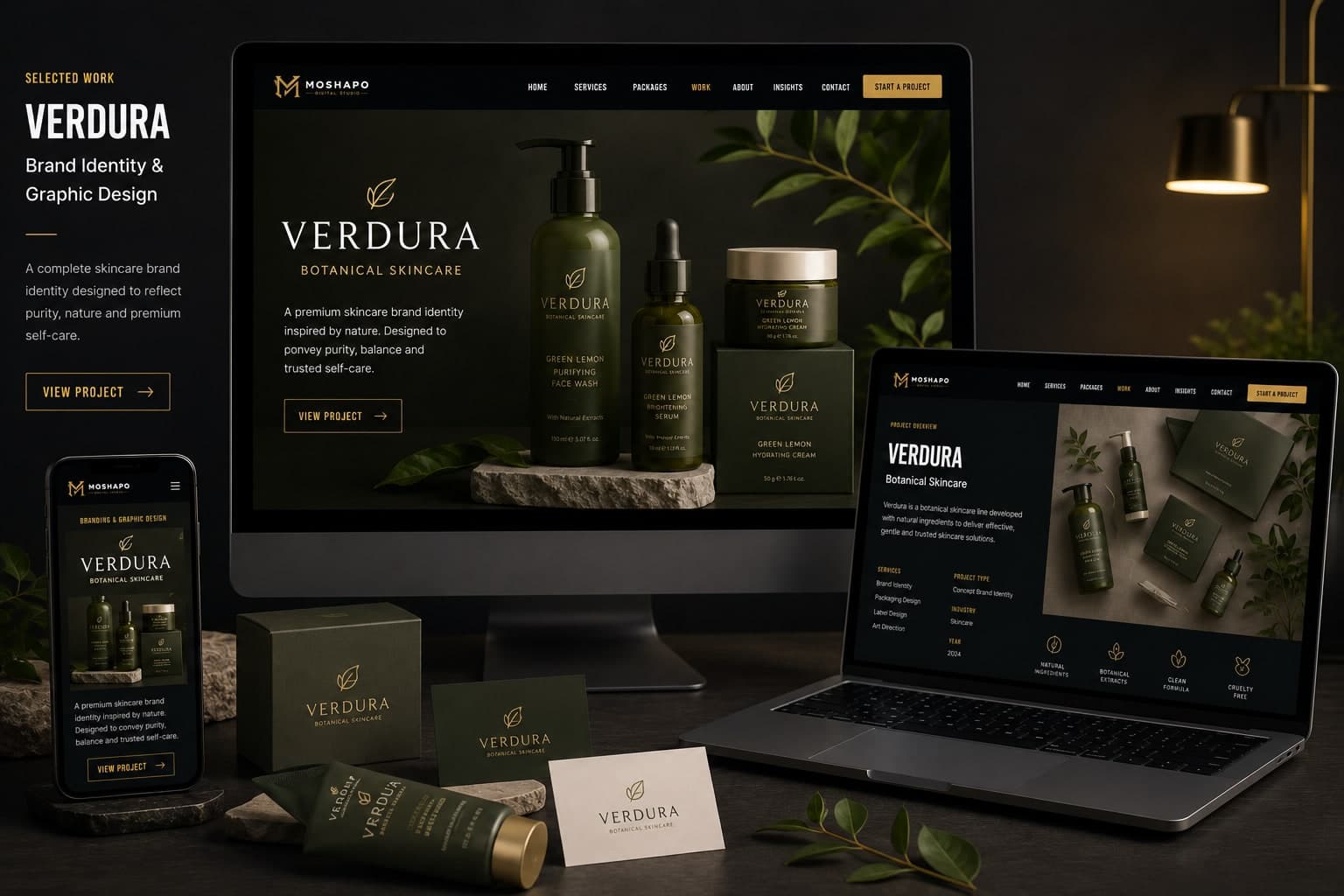
Verdura is an original botanical skincare brand created in-house by Moshapo Digital Studio — a self-directed project used to work through a complete identity system end to end, from naming and palette through to packaging and campaign art direction.
The point was to show branding as its own discipline, separate from building websites: the thinking, the craft, and the consistency that hold an identity together across every surface it lands on.
Challenge
A skincare brand has to read as clean and trustworthy on a shelf crowded with competitors making the same natural-ingredient claims. The identity had to feel botanical without tipping into the generic green-leaf territory every wellness brand already occupies.
Approach
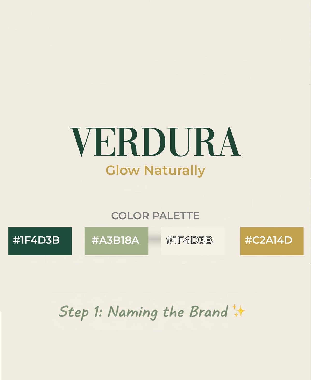
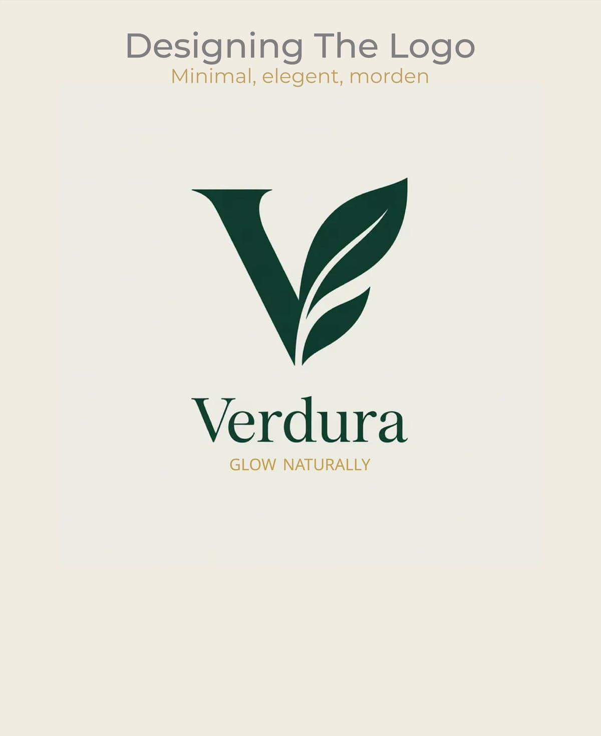
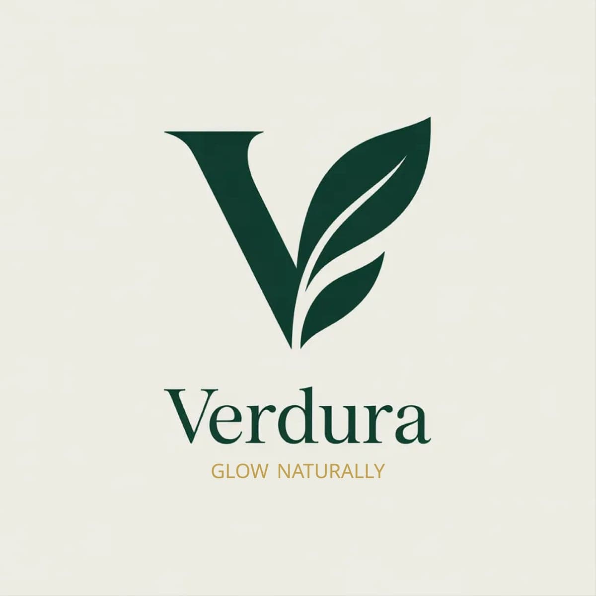
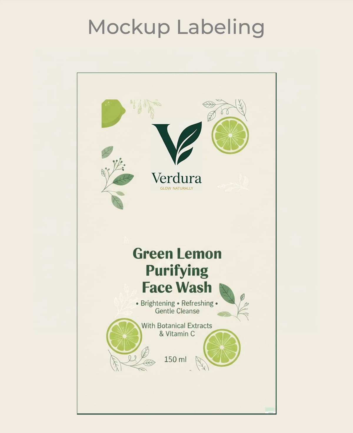
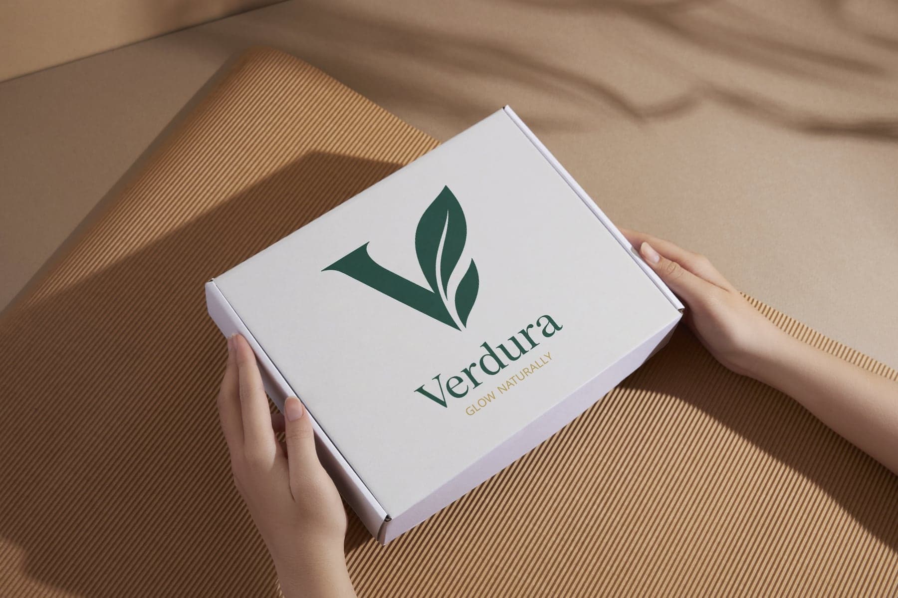
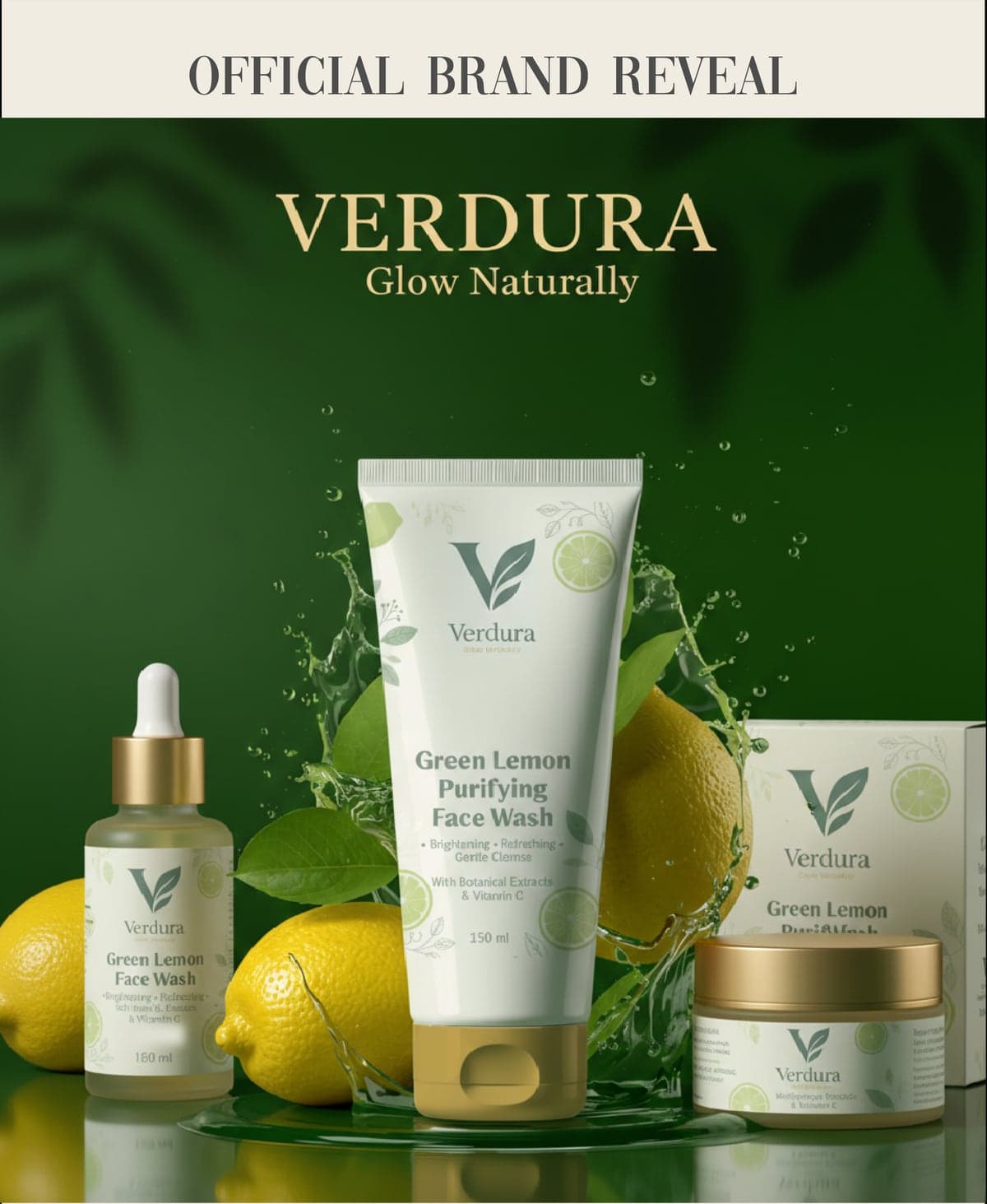
The project ran in sequence, each stage building on the last — naming and a botanical palette first, then a leaf-and-V monogram drawn to hold up at both signage and label sizes, then artwork for the first product, then cartons and packaging, and finally the campaign photography. Each step had to survive the next without the identity drifting.
Solution
A complete identity system: wordmark and monogram, a deep green, cream, and warm gold palette, label design for the Green Lemon Purifying Face Wash, carton and packaging design, and the launch campaign visuals.
Got a project in mind?
Tell us what you need. You're dealing with us directly, so replies are fast — usually within a few hours.